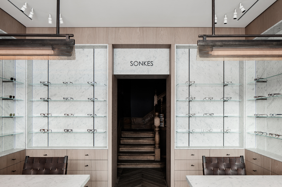
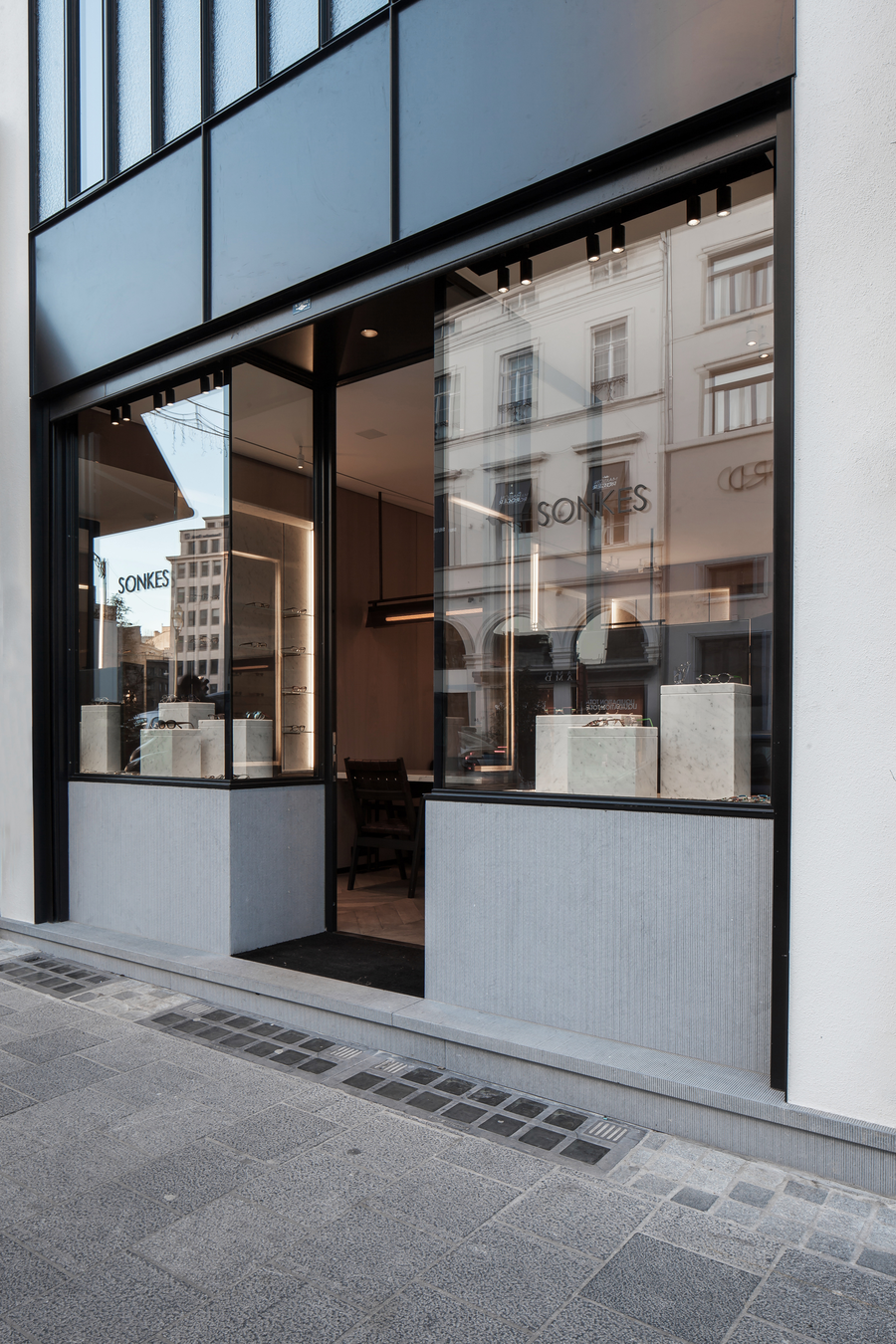


Everyone in Brussels knows the iconic optical shop Lionel Sonkès. It’s a beautiful collection of eyewear, centrally located, and tiny—perhaps 400 square feet. One day we got a call from the owner who had heard of us from friends of friends, and he was looking for a fresh vision for his shop.
Working on a commercial space is different from working on a residence due to the fast-tracked pace of the process. As a business owner, rent remains due during construction, and often you’re putting a substantial effort into a space you don’t own. The way we account for that is to spend most of our time on design, to make sure that construction will only start once every detail has been talked through. In this instance, planning was all the more important because it was a small and challenging space for a contractor to work in, and there was a tight deadline that had to be respected.
There are also decorative and functional elements of shops that are different from those of houses. The original shop was supremely classical, it could have been from the London of the 1920s—elegant, but very dark and dated. The challenge was to create something new, elegant, and timeless. This was an intellectual challenge of working with a small space on a deadline, but with an incomparable advantage of designing an entirely custom-made project for a business with so much history.
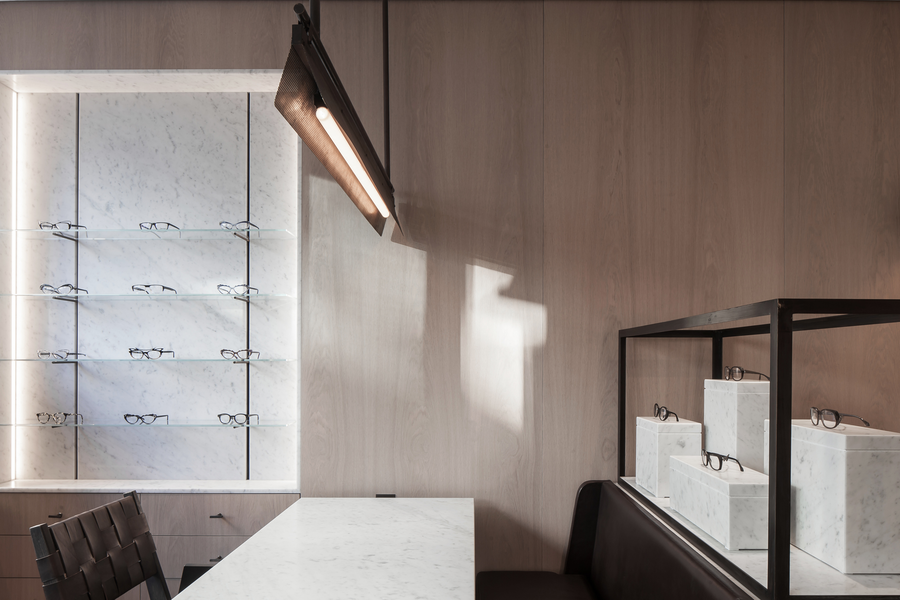
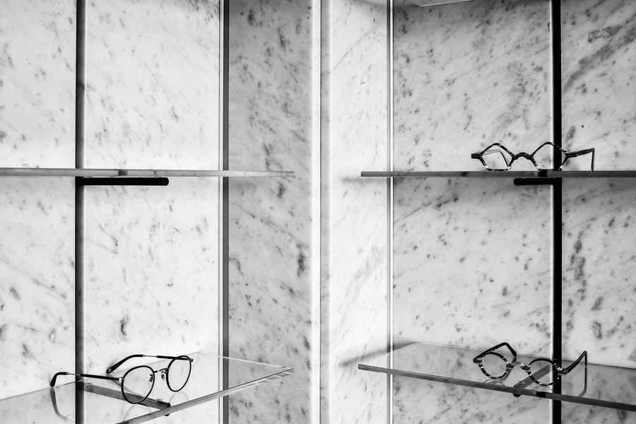
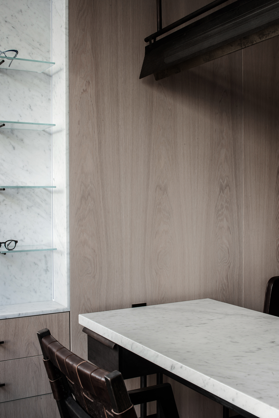
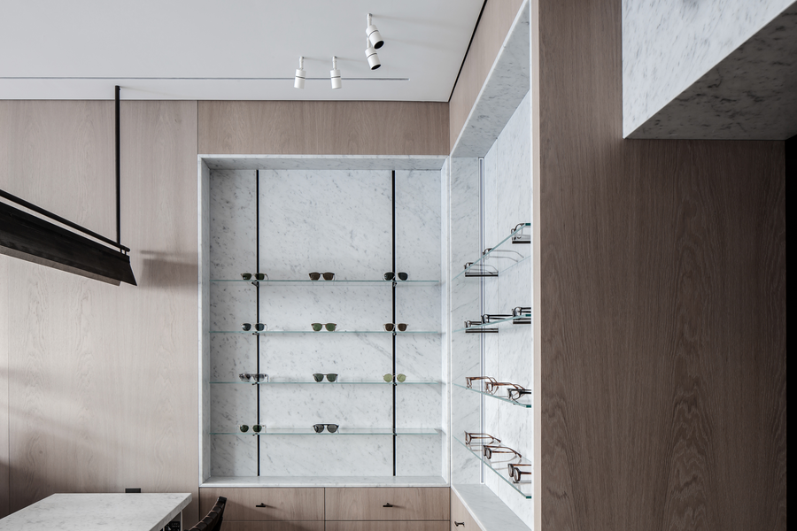
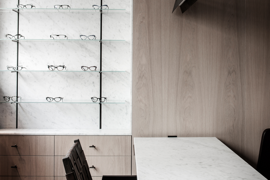
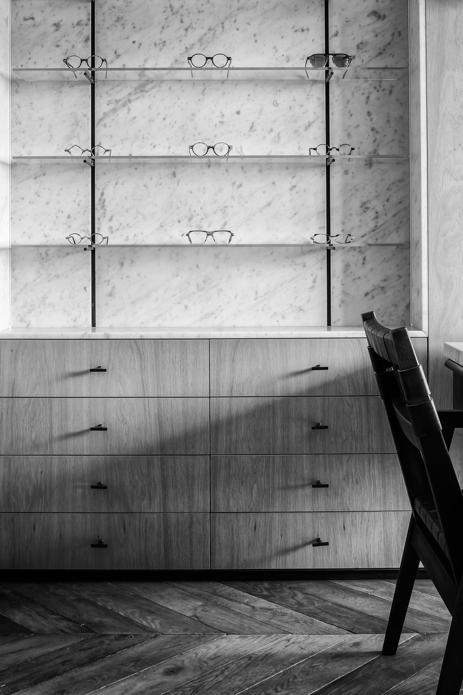
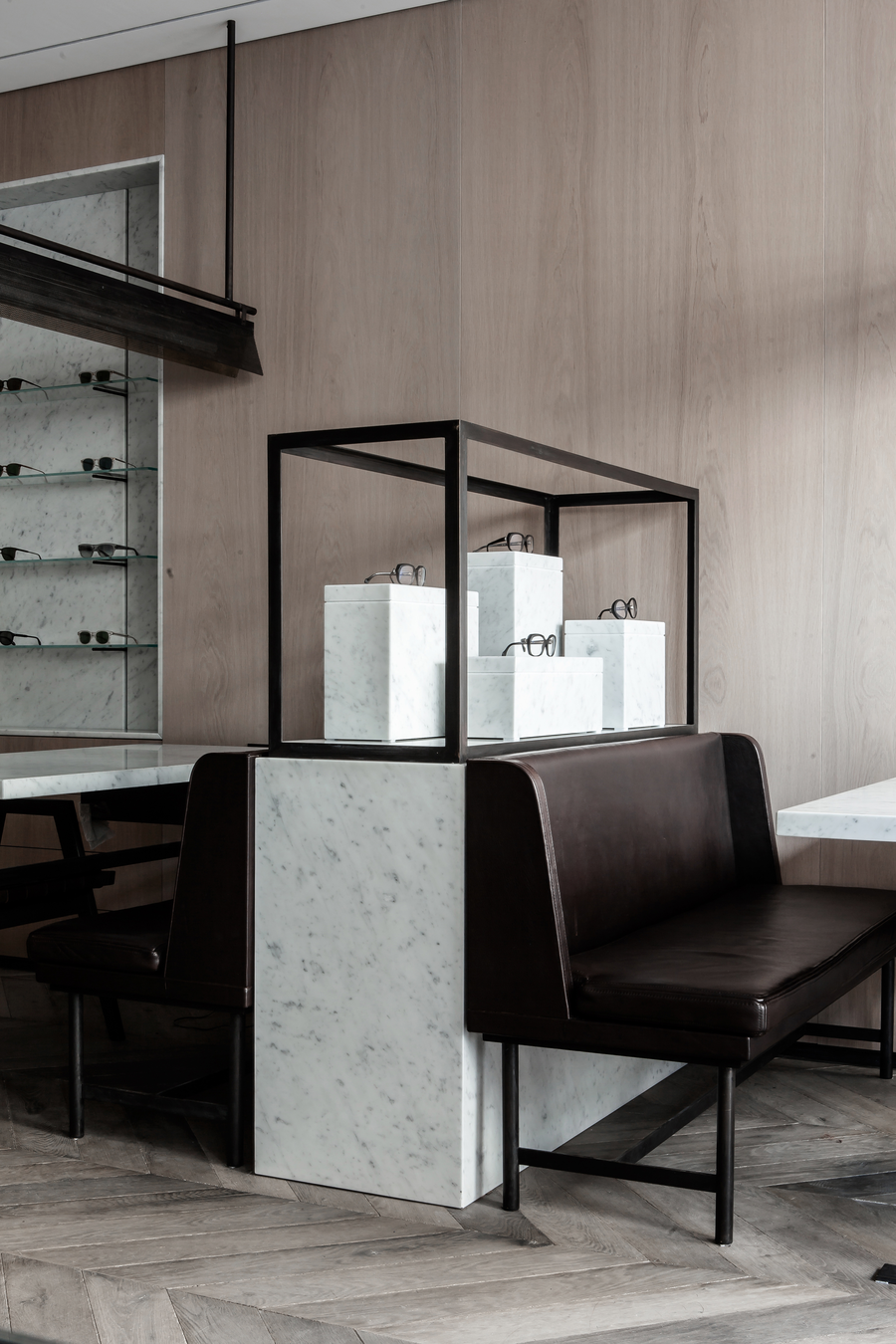
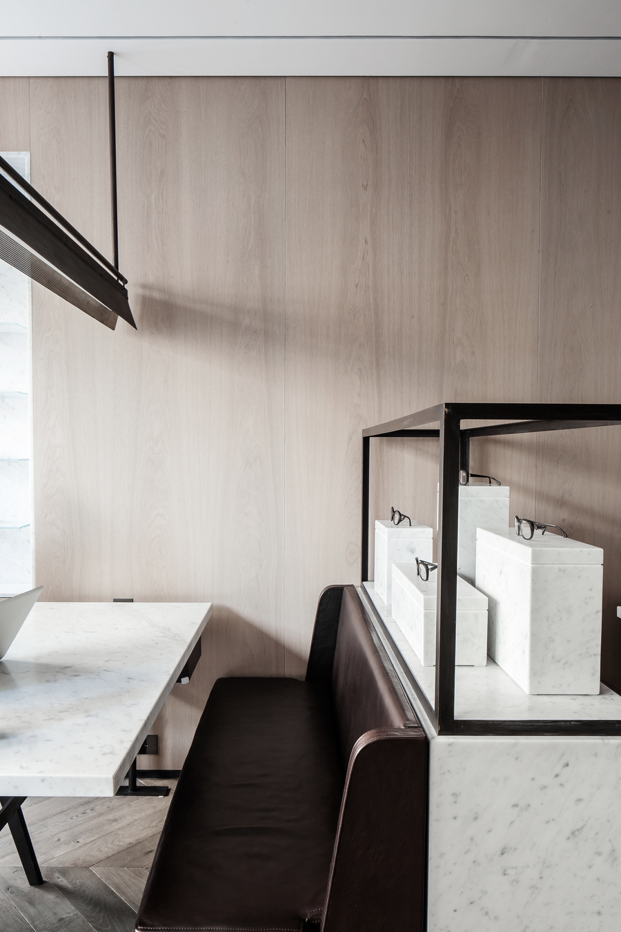
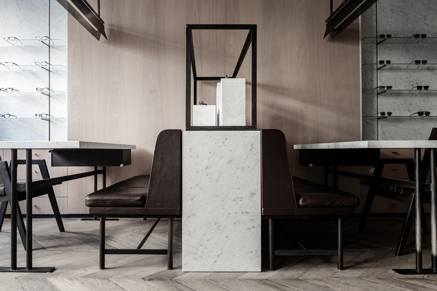
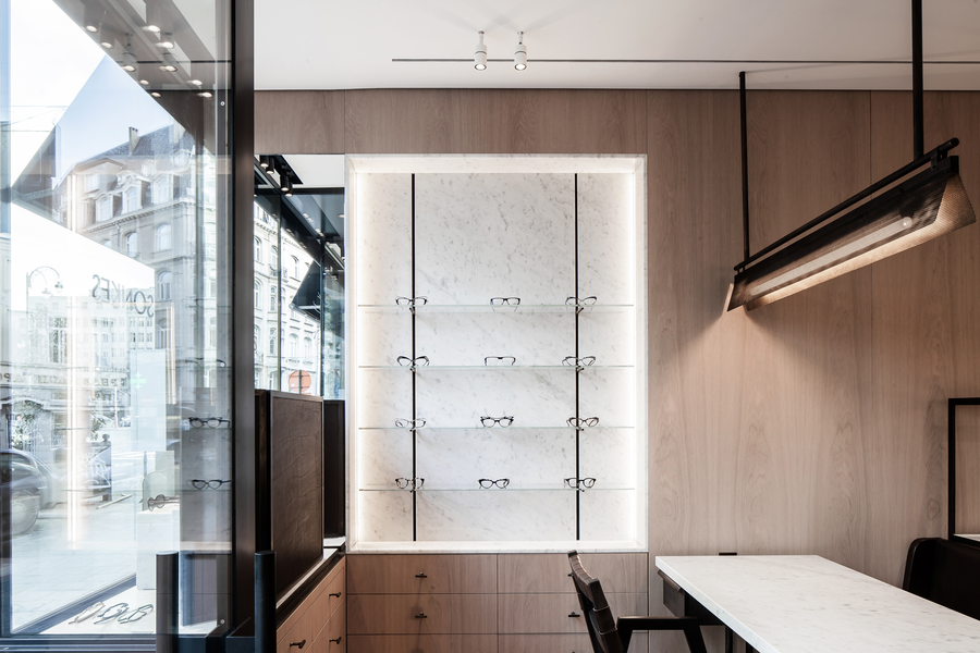
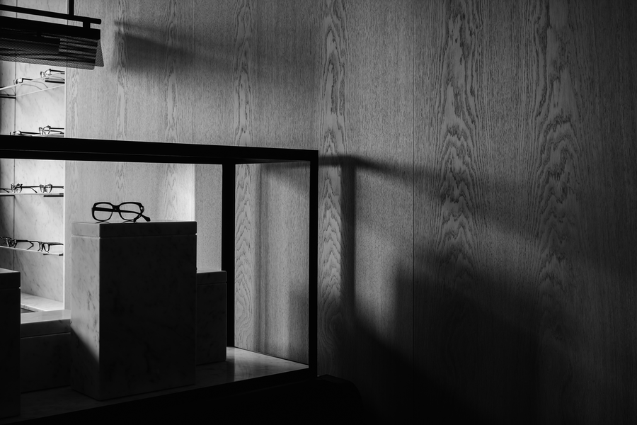
Outside, the façade was completely redesigned with thin steel window profiles, and the awnings were removed to allow for more natural light. Inside, we worked in collaboration with Marc Merckx to create a space that you might have found in Austria or Germany of the 1920s, but updated for today. We added a sense of playful elegance by employing a classic Belgian material palette including a stained oak chevron floor and a slightly brushed oak veneer on the walls. We made the presentation of the glasses elevate the artistry of their shapes by using honed Carrara marble for all the presentation blocks as well as the tables and niches in which the glasses are presented. Dark distressed leather and oil-rubbed bronze touches added another layer of elegance to this space that opened up with a sense of timelessness through our collaborative interventions.
