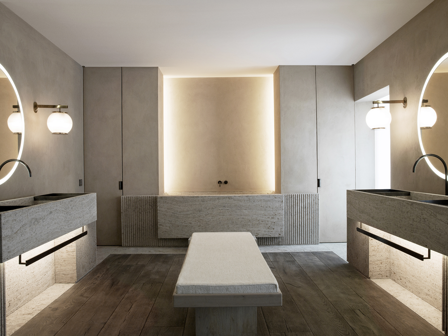
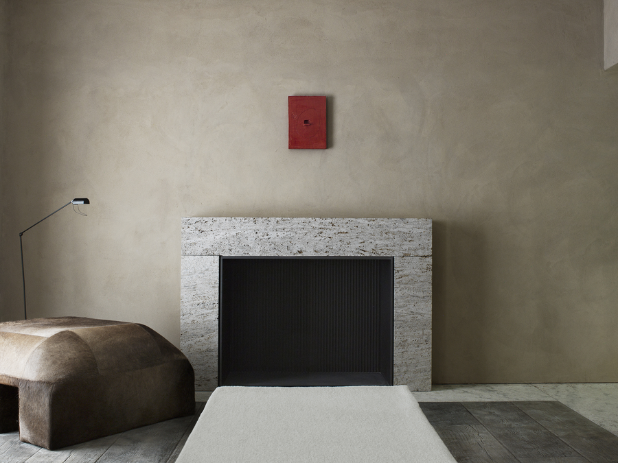
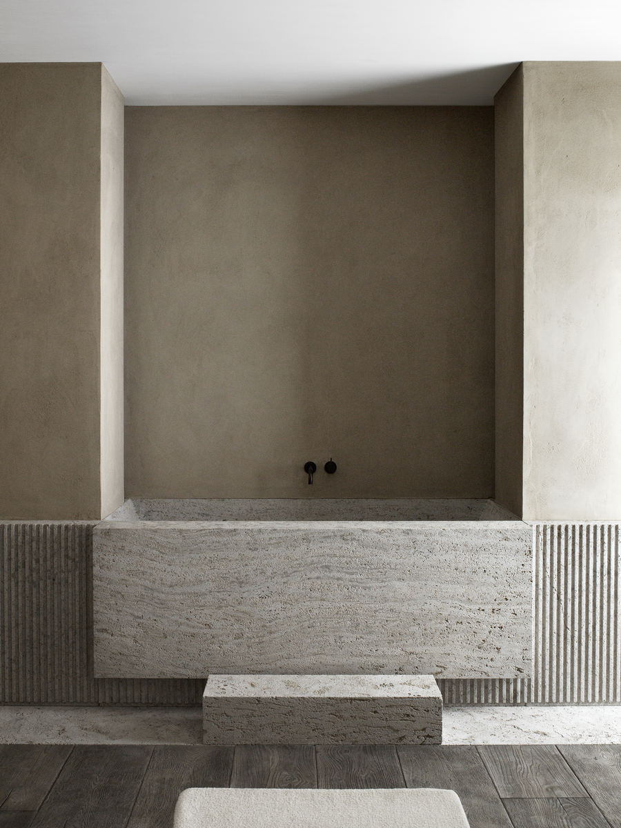
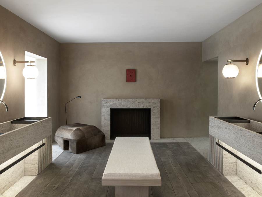


AD Intérieurs was initiated ten years ago by Architectural Digest France, a platform bringing ten different architects and designers together in Paris and giving each of them a room and “carte blanche” to show their style and craftsmanship. It is reminiscent of what used to happen in Parisian salons of the 1920s, which allowed artists who often worked for private clients to show in a public space.
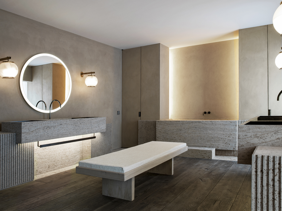
We were flattered to be invited and took the opportunity to show a bathroom. In some ways it was an unusual choice given that this is such a private space, but the bathroom is one of the rooms in a house were people invest the most money and the bathroom is a space that contributes to the comfort that can be felt in all the other rooms of the dwelling. More so, this was the perfect challenge for us: How could we do a purely interior project but give it a strong architectural dimension, using proportions, symmetry, and alignments, which had powered many of our previous projects? It was also an opportunity for us to bring in all the brilliant craftsman and artisans—like Obumex, Eggermont, Odilon or Mform—that we had been working with for the past years and to publicly celebrate their talent.
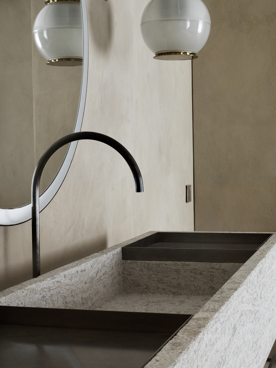
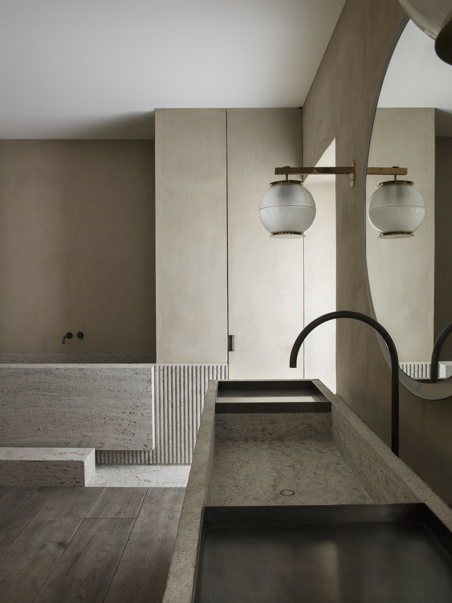
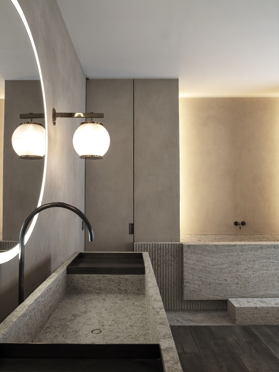
There was no context in this project—it was about this room and this room only—a sort of “world in a box.” It was also a project without any room for excuses, because there was no client and no real limits. These are typically very important considerations, especially in the level of detail that is needed in interior design. This was a project where we could design for ourselves, and I loved the freedom and demands of that, as well as the energy and drive that comes along with this freedom. Here, the slatted stone is reminiscent of Art Deco details that I have always been drawn to. The firm has never really been asked to do this kind of work before, and in most cases such details would simply not work with the rest of the architecture, and producing these kinds of details would be prohibitively expensive. We were able to create a bathroom that felt like a temple, capturing that Turrell and Brâncuși feeling that we evoked in our Biennale Interieur project that we were concurrently working on.
Paradoxically, this was the first time we were able to create work with a direct link to a public under our own name, sharing our work with a true audience and not just the guests of our clients. I spent several days in the installation, and it was especially rewarding to watch and listen to people move through the space. I could see the emotions that the space created and watch the change come across peoples’ faces as they entered. I could sense a feeling of calm and serenity exuding from the visitors, which gave me a sense of satisfaction that our designs could create such an effect for so many different kinds of people.
